C o m u n
a neobank promoting social mobility for immigrants and their families
UI Animations
-
Define key frame transitions (or state transitions) for relevant style properties
-
Define key frame transitions (or state transitions) for relevant style properties
-
Trigger animation sequences
-
If needed/optionally, interpolate values to to fit style property format
-
Assign the animated values to the style properties
[ 0 0 1] Define values
Define initial values for relevant style properties
const rotation = useRef(new Animated.Value(0)).current;
const cardWidth = useRef(new Animated.Value(CARD_WIDTH.MINIMUM)).current;
const cardLeftBorderRadius = useRef(new Animated.Value(CARD_BORDER_RADIUS_LEFT.MAXIMUM)).current;
const cardRightBorderRadius = useRef(new Animated.Value(CARD_BORDER_RADIUS_RIGHT.MINIMUM)).current;
const stripWidth = useRef(new Animated.Value(CARD_STRIP_WIDTH.MINIMUM)).current;
[ 0 0 2] Define transitions
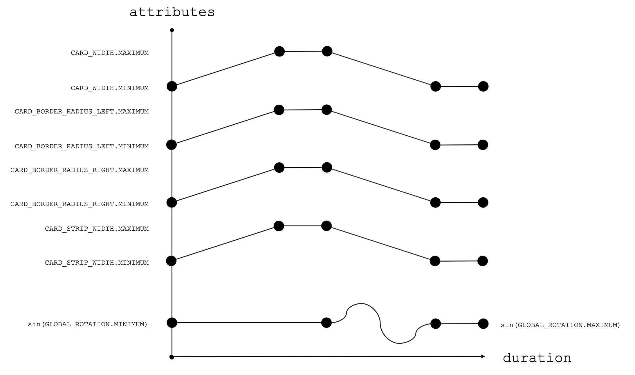
Define key frame transitions (or transition states) for relevant style properties. These transition states are created by Animated.timing
 const widthIncrease = useMemo(() => {
  cardWidth.setValue(CARD_WIDTH.MINIMUM);
   return Animated.timing(cardWidth, {
     toValue: CARD_WIDTH.MAXIMUM,
     duration: PERIOD,
     easing: Easing.ease,
     useNativeDriver: false,
   });
 }, [cardWidth]);
animated.timing
Sets up the transition between the initial and final value or state (or, keyframes) over an interval of time.
toValue: determines the final value, state, or keyframe
duration: determines the transition interval of time in milliseconds
easing: determines the shape of this path
easing: Easing.linear
Animated.delay
keeps a value, state, or keyframe constant for a given duration of time in milliseconds.
Animated.Sequence
takes in a list of the behaviors of values over time – i.e. changes in values over time (Animated.timing) and constants values over time (Animated.delay) that occur one after another (sequentially). The goal is to create a continuous path.
Note: can be nested inside an Animated.parallel list
Animated.Parallel
takes in a list of the behaviors of values over time – i.e. changes in values over time (Animated.timing) and constants values over time (Animated.delay) that occur at the same time (in parallel).
Note: can be nested inside an Animated.sequence list
[ 0 0 3] Sequence
Trigger animation sequences
 Animated.loop(
   Animated.sequence([
     Animated.parallel([
       widthIncrease,
       leftBorderRadiusIncrease,
       rightBorderRadiusIncrease,
       stripWidthIncrease,
     ]),
     Animated.delay(DELAY),
     Animated.parallel([
       rotate,
       widthDecrease,
       leftBorderRadiusDecrease,
       rightBorderRadiusDecrease,
       stripWidthDecrease,
     ]),
     Animated.delay(DELAY),
   ])
 ).start();
[ 0 0 4] interpolation
If needed/optionally, interpolate values to to fit style property format
 const interpolateRotation = useMemo(
   () =>
     rotation.interpolate({
       inputRange: [0, 1],
       outputRange: [GLOBAL_ROTATION.MINIMUM, GLOBAL_ROTATION.MAXIMUM],
     }),
   [rotation]
 );
Example: interpolate [0, 1] to [“0deg”, “360deg”] for rotation style property
[ 0 0 5] Assign animations
Assign the animated values to the style properties
  const globalRotation = useMemo(
   () => ({
     transform: [{ rotate: interpolateRotation }],
   }),[interpolateRotation]);

 const animateCard = useMemo(
   () => ({
     borderTopLeftRadius: cardLeftBorderRadius,
     borderBottomLeftRadius: cardLeftBorderRadius,
     borderTopRightRadius: cardRightBorderRadius,
     borderBottomRightRadius: cardRightBorderRadius,
     width: cardWidth,
   }),[cardLeftBorderRadius, cardRightBorderRadius, cardWidth]);

 const animatedStrip = useMemo(
   () => ({
     width: stripWidth,
   }),[stripWidth]);
<View style={styles.animationContainer}>
<Animated.View style={[styles.cardContainer, globalRotation]}>
<Animated.View style={[styles.stripLight, animatedStrip]} />
<Animated.View style={[styles.card, animateCard]} />
</Animated.View>
</View>


